Digital posters are an incredible way to convey information visually, whether for an event, a product, or a personal project. They’re not just confined to professional designers anymore. With the right tools and a bit of creativity, anyone can create stunning digital posters from the comfort of their home. This guide will walk you through each step of the process, from understanding what a digital poster is to sharing your final design.
Table of Contents
ToggleUnderstanding Digital Posters
What is a Digital Poster?
A digital poster is a graphic design created on a computer, intended to be viewed on screens or printed out. Unlike traditional posters, digital posters can be easily edited and shared online, making them highly versatile.
Benefits of Digital Posters
1. Versatility: Easy to share and distribute.
2. Cost-Effective: No printing costs unless needed.
3. Editable: Simple to make changes and updates.
Essential Tools and Software
Free vs. Paid Software
Choosing the right software depends on your budget and needs. Free tools like Crafty Art and GIMP are great for beginners, while Adobe Photoshop and Illustrator offer advanced features for professionals.
Recommended Tools for Beginners
1. Crafty Art: User-friendly with many templates.
2. GIMP: A powerful, free alternative to Photoshop.
3. Inkscape: Ideal for vector graphics.
Advanced Tools for Professionals
1. Adobe Photoshop: Comprehensive editing features.
2. Adobe Illustrator: Best for vector-based designs.
3. CorelDRAW: Another professional-grade option.
Planning Your Digital Poster
Define Your Purpose
Understand the goal of your poster. Are you promoting an event, a product, or conveying information? This will guide your design choices.

Know Your Audience
Consider who will be viewing your poster. Tailor your design to their preferences and expectations.
Conceptualize Your Design
Sketch out rough ideas or create a mood board. This helps in visualizing the final product and streamlining the design process.
Choosing the Right Dimensions
Standard Poster Sizes
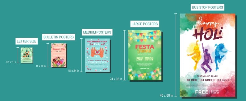
Common sizes include 18×24 inches, 24×36 inches, and 27×40 inches. Choose based on where and how you plan to display the poster.
Custom Dimensions
For specific needs, you might opt for custom dimensions. Ensure your design software supports the size you need.
Aspect Ratio Considerations
Maintain a consistent aspect ratio to avoid distortion when resizing. Popular ratios include 4:3 and 16:9.
Selecting a Design Template
Using Pre-made Templates
Templates can save time and provide a professional look. Platforms like Crafty Art offer thousands of templates tailored to various purposes.
Creating Your Own Template
For a unique touch, design your own template. This allows for complete creative control and customization.
Color Theory and Schemes
Basics of Color Theory
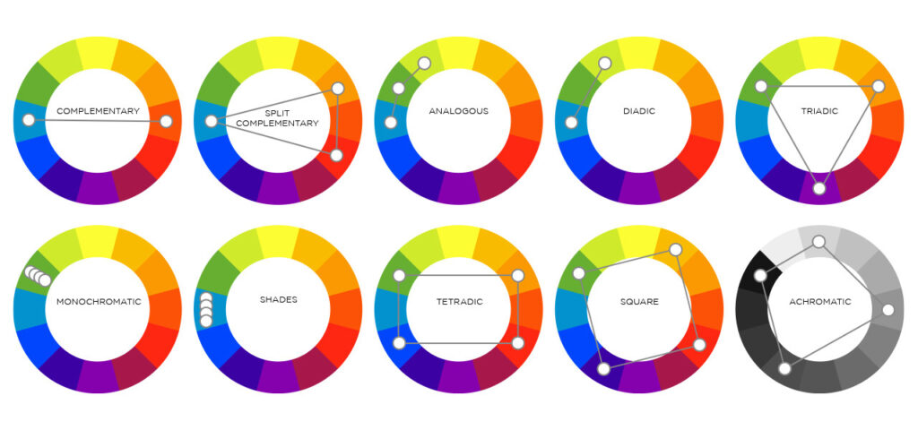
Understanding primary, secondary, and tertiary colors is crucial. Use the color wheel to create harmonious schemes.
Tools for Color Selection
Use online tools like Crafty Art Colors to find and create color palettes.
Typography Tips
Importance of Typography
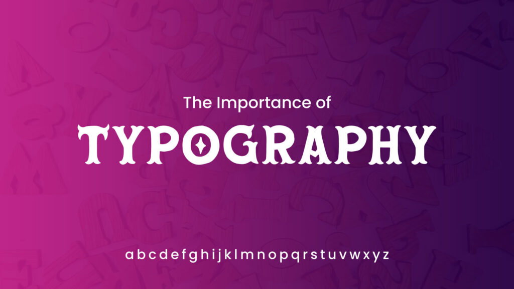
Typography sets the tone of your poster. It can make or break your design, so choose wisely.
Choosing the Right Fonts
Pick fonts that are readable and match the poster’s theme. Avoid using too many different fonts; two or three are usually enough.
Pairing Fonts Effectively
Combine a strong header font with a more readable body font. Ensure they complement each other and enhance readability.
Incorporating Images and Graphics
Sourcing High-Quality Images
Use royalty-free image sites like Unsplash, Pexels, or Pixabay to find high-resolution photos.
Using Icons and Illustrations
Icons and illustrations can add character to your poster. Websites like Flaticon and Freepik offer a wide range of options.
Image Editing Basics
Basic editing skills, like cropping, resizing, and adjusting brightness and contrast, can significantly improve your images.
Adding Text and Messaging
Crafting Your Message
Keep your message clear and concise. Highlight key information and ensure it aligns with your poster’s purpose.
Text Placement and Hierarchy
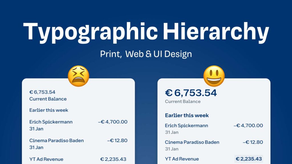
Organize your text so that the most important information stands out. Use headings, subheadings, and bullet points effectively.
Using Call-to-Actions (CTAs)
Incorporate compelling CTAs if your poster is meant to drive action, such as “Sign Up Now” or “Learn More.”
Utilizing Shapes and Lines
Adding Visual Interest
Shapes and lines can break up text and guide the viewer’s eye. Use them to highlight important areas or create patterns.
Creating Balance with Shapes
Balance your design by distributing shapes evenly. Symmetry and asymmetry both have their place in design.
Guiding the Viewer’s Eye
Use lines and arrows to lead the viewer through your poster logically and comfortably.
Layering and Composition
Understanding Layers
Layers help in organizing different elements of your design. Most graphic software supports layer-based editing.
Techniques for Effective Composition
Rule of thirds, symmetry, and focal points are key techniques. These help in creating a balanced and engaging design.
Reviewing and Refining Your Design
Proofreading and Editing
Check for spelling and grammar errors. A polished poster is free of mistakes and communicates clearly.
Getting Feedback
Ask friends or colleagues for feedback. A fresh pair of eyes can catch errors and suggest improvements.
Making Final Adjustments
Incorporate feedback and refine your design. Make sure every element is aligned and harmonious.
Exporting and Sharing Your Poster
Best Formats for Export
Export your poster in high resolution. Common formats include JPEG, PNG, and PDF.
Tips for Printing
If you plan to print, ensure your resolution is at least 300 DPI. Use CMYK color mode for accurate color reproduction.
Sharing Digitally
Optimize your poster for digital platforms. Reduce file size without sacrificing quality for faster loading times.
Conclusion
Creating a digital poster at home is an exciting and rewarding process. By following these steps, you can produce professional-quality posters that captivate and communicate effectively. So, fire up your design software and start creating!


