Introduction
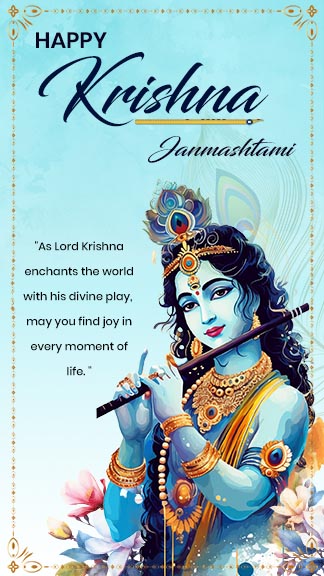
Color is more than just a visual experience; it’s a powerful tool that can influence emotions, perceptions, and even behavior. When it comes to festival posters, the colors you choose can make a significant impact on how people perceive the event and whether they feel compelled to attend. In this article, we’ll explore the fascinating world of color psychology and how you can use it to create compelling festival posters that influence mood and drive attendance.
Understanding Color Psychology
What is Color Psychology?
Color psychology is the study of how colors affect human emotions and behavior. It’s based on the idea that different colors can evoke specific feelings and responses. For example, red can increase energy levels and excitement, while blue can create a sense of calm and trust.
Historical Background of Color Psychology
The study of color psychology dates back to ancient civilizations. The Egyptians and Chinese used color for healing purposes, a practice known as chromotherapy. In modern times, psychologists and marketers have studied the effects of color on human behavior more scientifically.
The Science Behind Color Perception
Color perception begins with the eye’s ability to detect light. Upon impact, an object reflects specific wavelengths of light that are interpreted by our eyes as color. This process involves the retina, which contains photoreceptors called cones that are sensitive to red, green, and blue light. The brain then interprets these signals and assigns them a color.
The Role of Color in Marketing
The Impact of Color on Consumer Behavior
Color can influence consumer behavior in various ways, from making a product more appealing to affecting purchasing decisions. Studies have shown that up to 90% of snap judgments made about products can be based on color alone.
How Businesses Use Color in Marketing Strategies
Businesses use color strategically to create brand identity, attract attention, and evoke emotions. For example, fast-food restaurants often use red and yellow because these colors can stimulate appetite and excitement.
The Importance of Festival Posters
Festival Posters as a Marketing Tool
Festival posters are a crucial element of event promotion. They serve as the first point of contact between the event and potential attendees. A well-designed poster can generate excitement, convey important information, and drive ticket sales.
The Evolution of Festival Poster Design
Festival poster design has evolved significantly over the years, from simple, text-heavy announcements to vibrant, visually engaging artworks. Today’s posters often feature a mix of bold colors, striking images, and creative typography.
Choosing the Right Colors for Festival Posters
Factors to Consider When Selecting Colors
When choosing colors for your festival poster, consider the event’s theme, target audience, and the emotions you want to evoke. The right color combination can convey the event’s atmosphere and attract the desired demographic.
Color Harmony and Contrast
The attractive combination of colors is referred to as color harmony. Colors that are harmonious can create a balanced and aesthetically pleasing look. Contrast, on the other hand, involves using colors that stand out against each other to draw attention to specific elements of the poster.
Red: The Color of Passion and Energy
Psychological Effects of Red
Passion, vigor, and excitement are all connected to the powerful color red. It can make people feel more urgent and raise their heart rates.
When to Use Red in Festival Posters
Use red in your festival poster to highlight important details, create a sense of excitement, and draw attention to key information. To prevent overwhelming the audience, use it wisely.
Blue: The Color of Trust and Calm
Psychological Effects of Blue
Blue is often associated with calmness, trust, and reliability. It can create a sense of peace and tranquility.
When to Use Blue in Festival Posters
Blue is ideal for events that aim to convey a sense of calm or professionalism. Use blue for background colors or text to create a trustworthy and serene vibe.
Yellow: The Color of Happiness and Warmth
Psychological Effects of Yellow
Yellow is a cheerful color that evokes feelings of happiness, warmth, and optimism. It can also increase mental activity and energy levels.
When to Use Yellow in Festival Posters
Use yellow to highlight key information and create a sense of joy and excitement. It’s perfect for summer festivals, family-friendly events, and activities that aim to spread happiness.
Green: The Color of Nature and Harmony
Psychological Effects of Green
Green is associated with nature, health, and harmony. It can create a sense of balance and renewal.
When to Use Green in Festival Posters
Green is ideal for eco-friendly events, outdoor festivals, and health-related activities. Use it to convey a sense of growth and harmony.
Purple: The Color of Luxury and Creativity
Psychological Effects of Purple
Purple is a color that signifies luxury, creativity, and sophistication. It can evoke feelings of mystery and grandeur.
When to Use Purple in Festival Posters
Use purple for upscale events, creative arts festivals, and activities that aim to convey a sense of elegance and imagination.
Black and White: The Colors of Simplicity and Sophistication
Psychological Effects of Black and White
Black is often associated with sophistication, power, and elegance, while white represents purity, simplicity, and cleanliness.
When to Use Black and White in Festival Posters
Use black and white for minimalist designs, formal events, and to create a timeless and classic look.
Using Color Combinations Effectively
Creating Visual Interest with Color Combinations
Combining colors can create visual interest and enhance the overall design of your poster. Use complementary colors for contrast, analogous colors for harmony, and triadic colors for a balanced yet dynamic look.
Examples of Effective Color Combinations
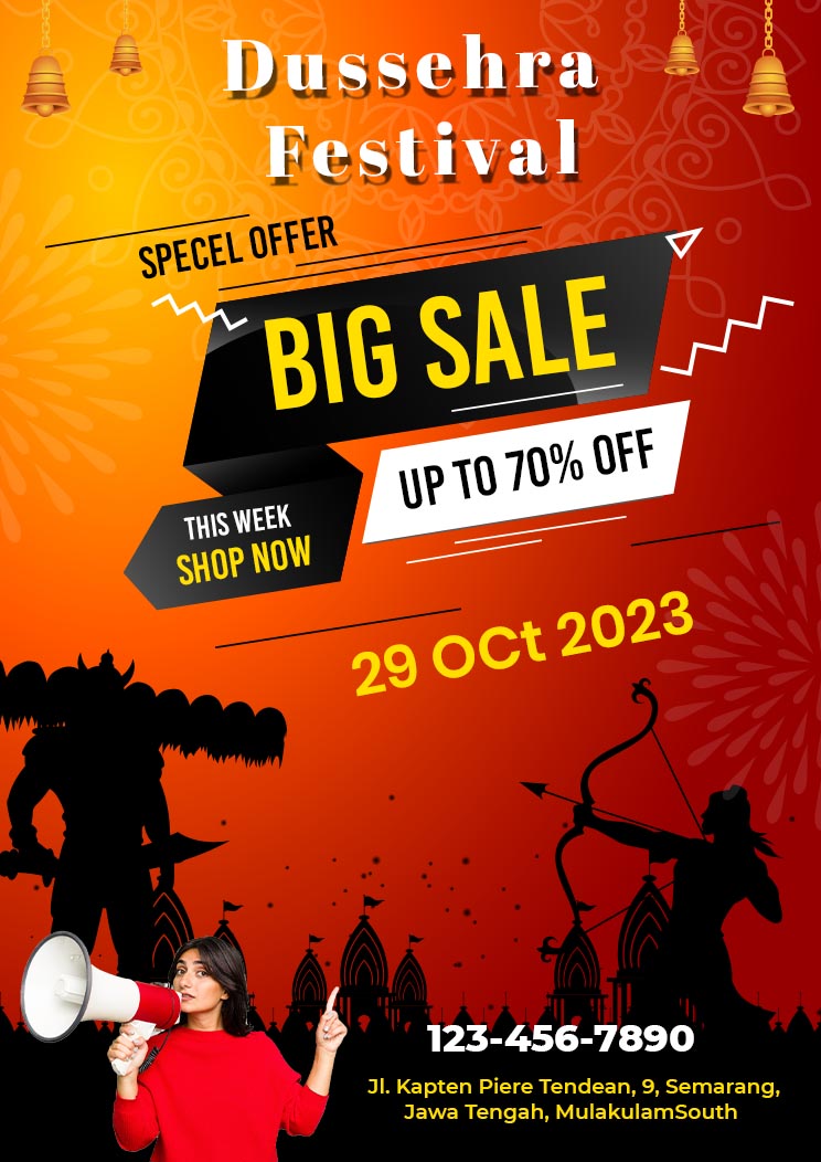
- Red and Yellow: Perfect for creating excitement and drawing attention.
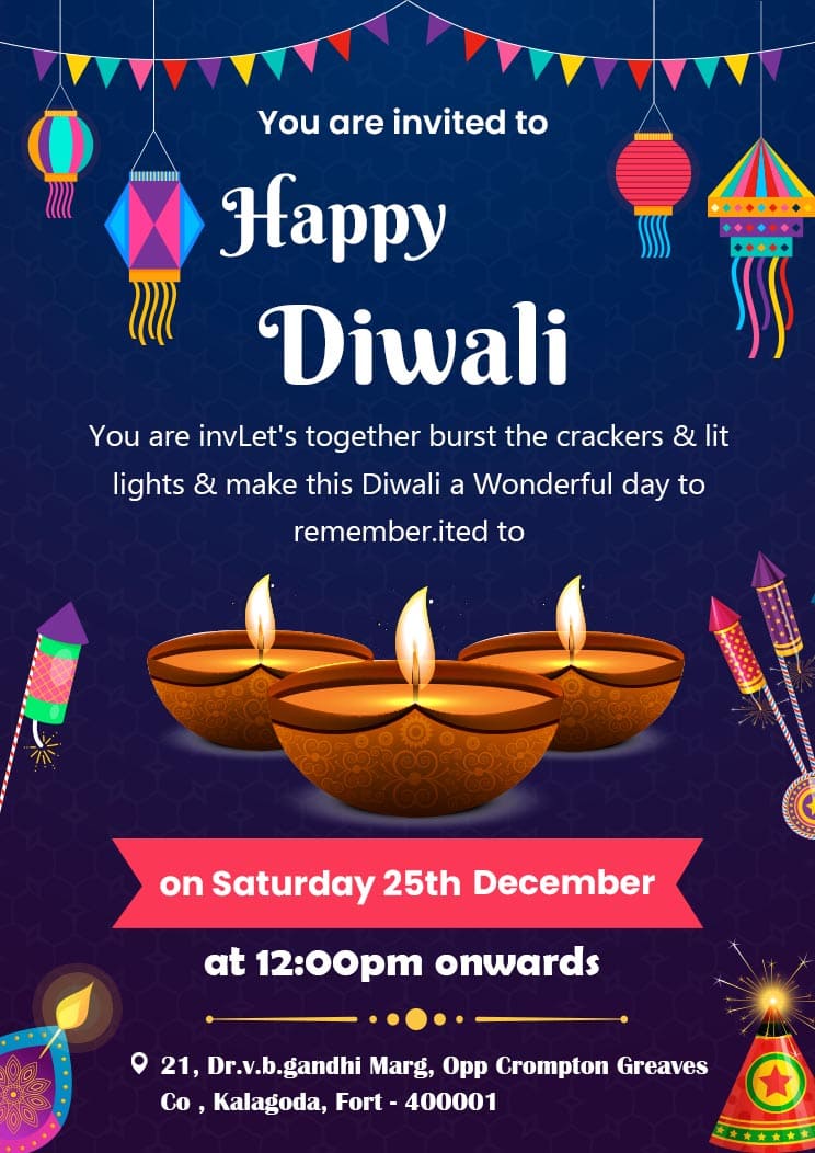
- Blue and White: Ideal for conveying trust and cleanliness.
- Green and Brown: Great for eco-friendly and nature-themed events.
Cultural Considerations in Color Choices
The Cultural Significance of Colors
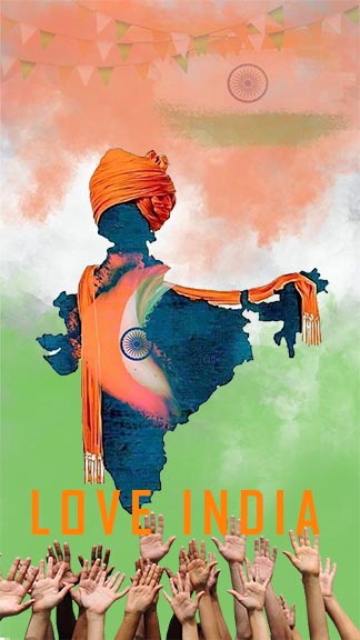
Colors can have different meanings and connotations in various cultures. For example, red is considered lucky in China but can signify danger in Western cultures.
Adapting Color Choices for Different Audiences
When designing festival posters for a diverse audience, consider the cultural significance of colors and choose hues that resonate positively with your target demographic.
Case Studies: Successful Festival Posters
Analysis of Successful Festival Posters
Examining successful festival posters can provide valuable insights into effective color usage. Look at posters that have garnered significant attention and analyze their color schemes, design elements, and overall impact.
Lessons Learned from These Examples
From these case studies, you can learn how to balance color harmony and contrast, create emotional resonance, and attract your target audience effectively.
Conclusion
Color is a powerful tool in festival poster design. By understanding the psychological effects of different colors and using them strategically, you can create posters that not only attract attention but also evoke the desired emotions and drive attendance. Whether you’re planning a lively music festival or a serene art exhibit, the right colors can make all the difference.

