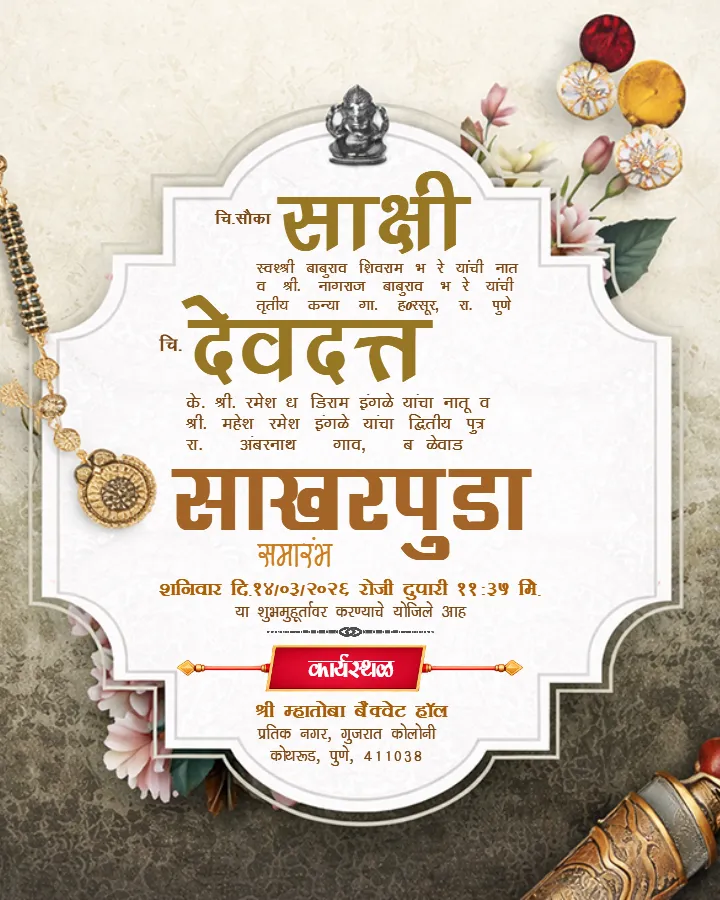
Online Invitation Card Maker for Personalized Invite Design
Create the perfect invitation card for weddings, birthdays, parties, and more. Use our online invitation card maker to customize templates quickly. Add photos, text, and themes that match your event. Make your invitation card look stunning and professional.
Create the perfect invitation card for any event in minutes.
9354+ Invitation Card
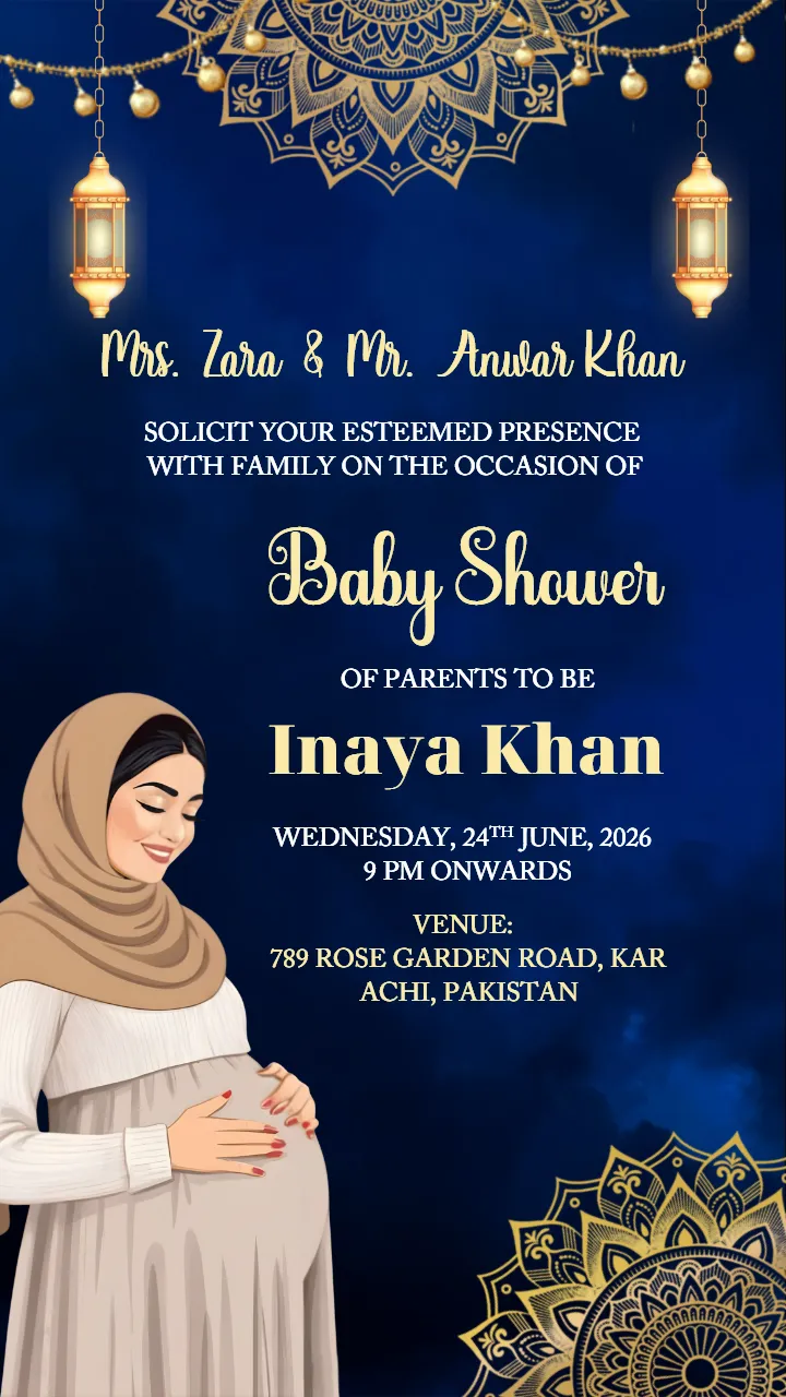
Design Stunning Islamic Baby Shower Invitation Card Easily
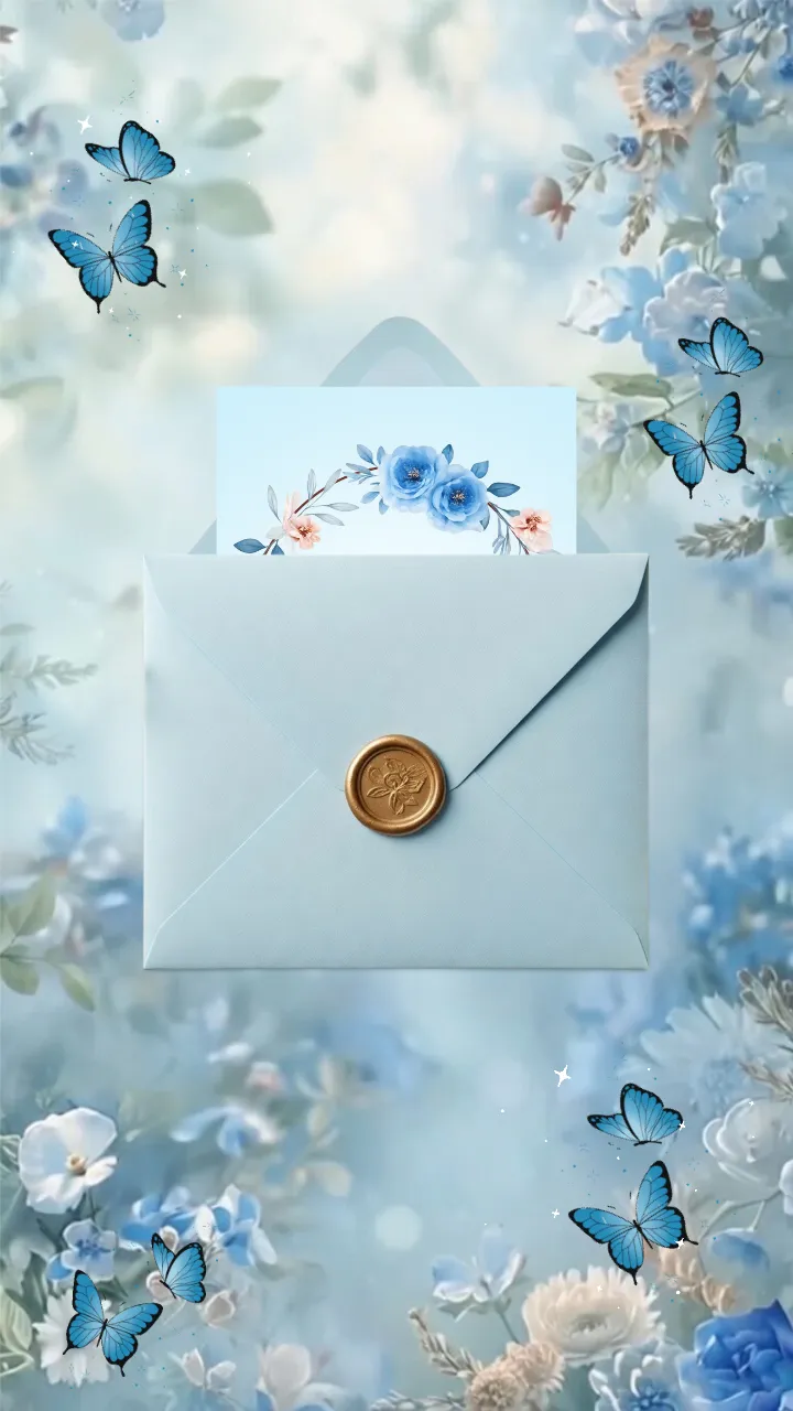
Birthday Invitation VIdeo for Blue Butterfly Floral Theme
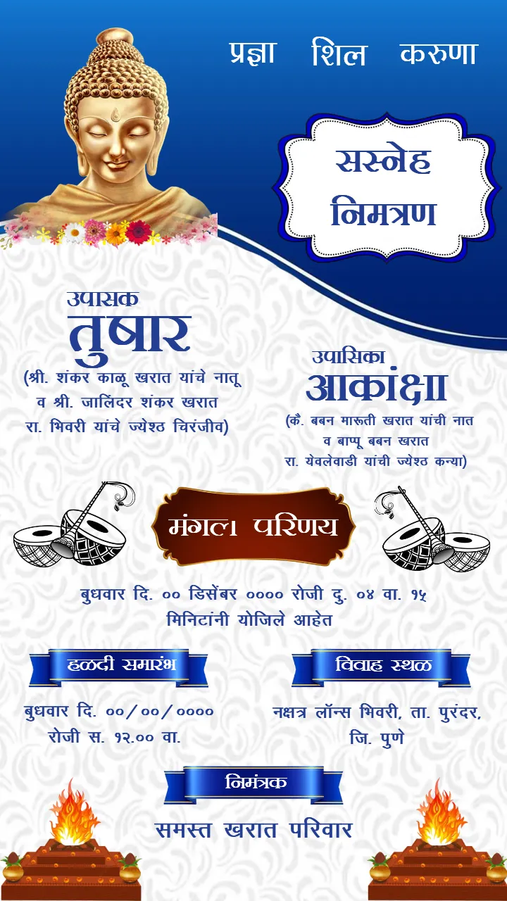
Marathi Buddhist Wedding Invitation Card Royal Blue Theme
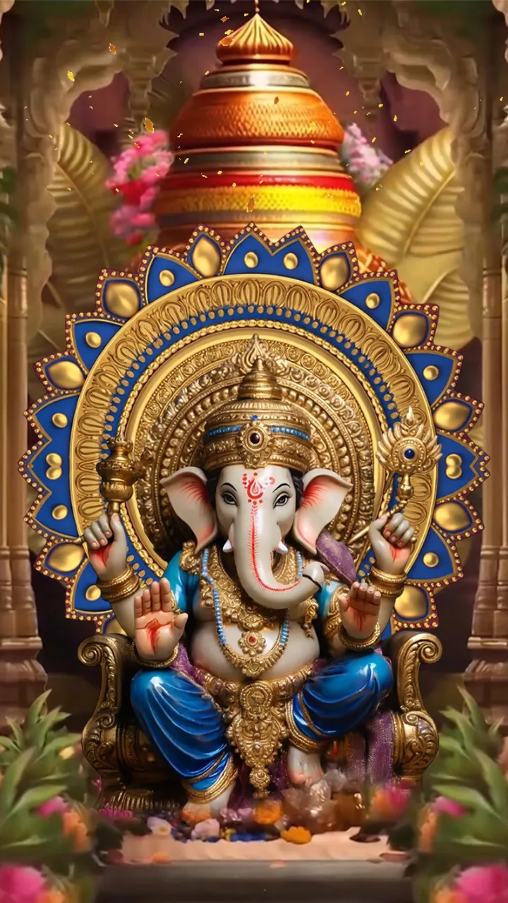
Hindi Wedding Invitation Video Traditional Mandap Theme

Wedding Invitation Video Luxury Royal Wedding Invite
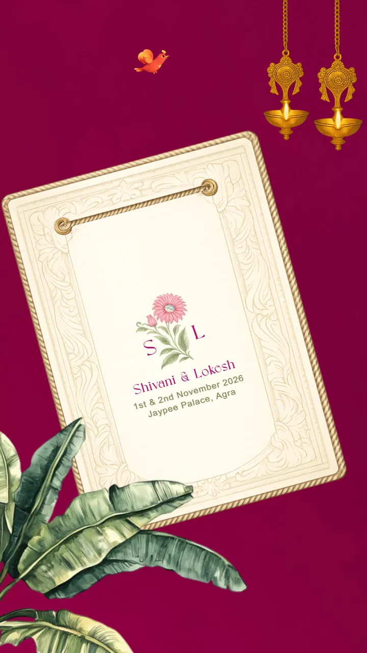
Animated Postcard Wedding Invitation Video for Your Big Day

Muslim Wedding Invitation Video Premium Walima Invite
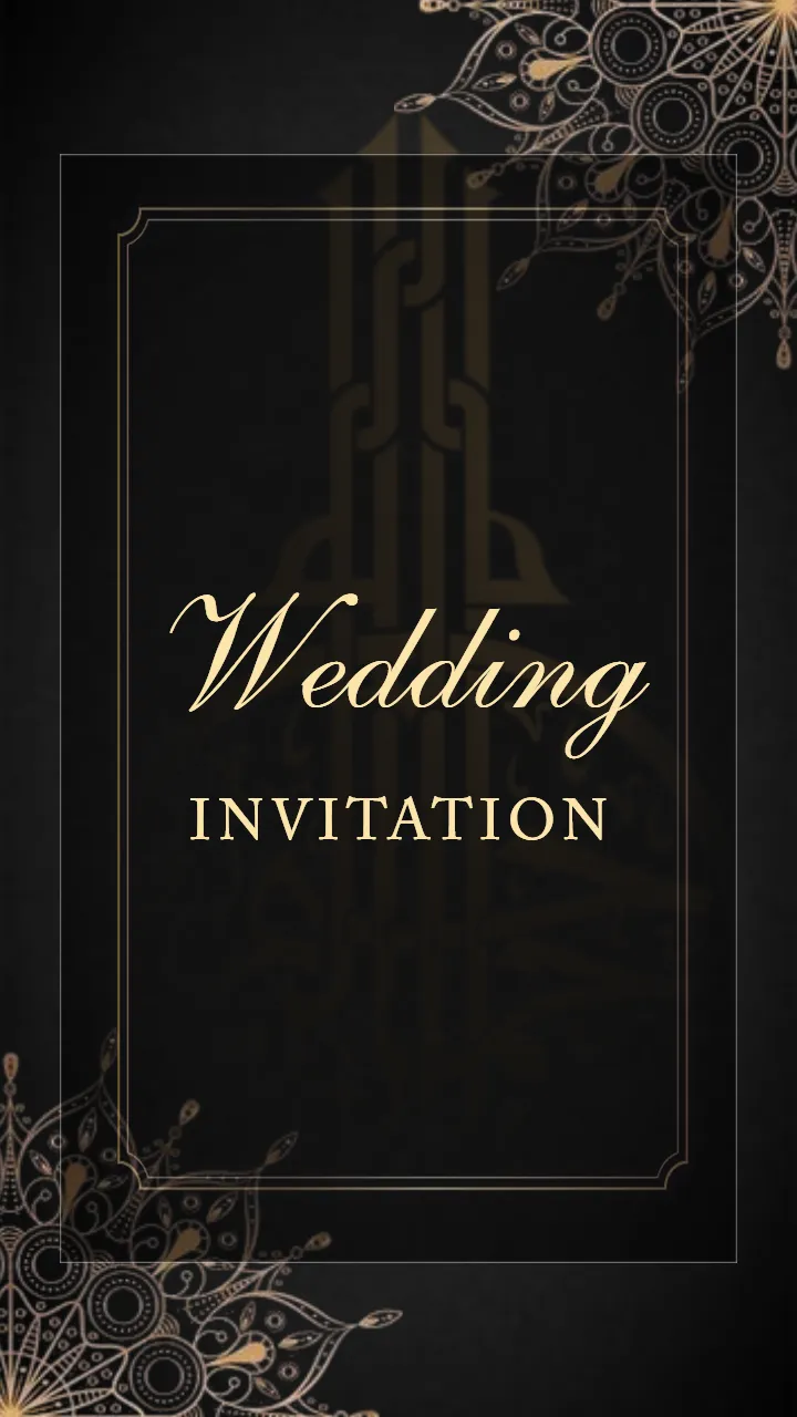
Muslim Wedding Invitation Video Black Gold Nikah Theme

Muslim Wedding Invitation Video Arabic Theme Invite

Muslim Wedding Invitation Video Islamic Nikah Design
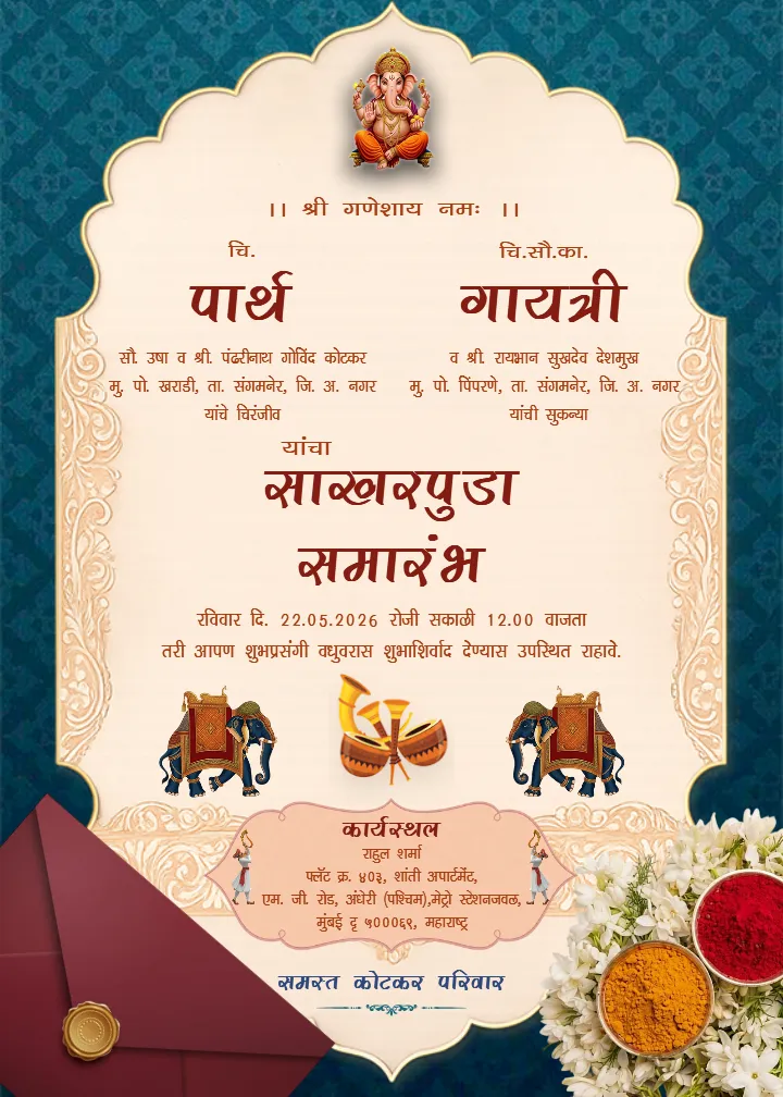
Attractive Sakharpuda Invitation Card with Ganesh Design
Sakharpuda Invitation Card with Royal Red Cultural Theme
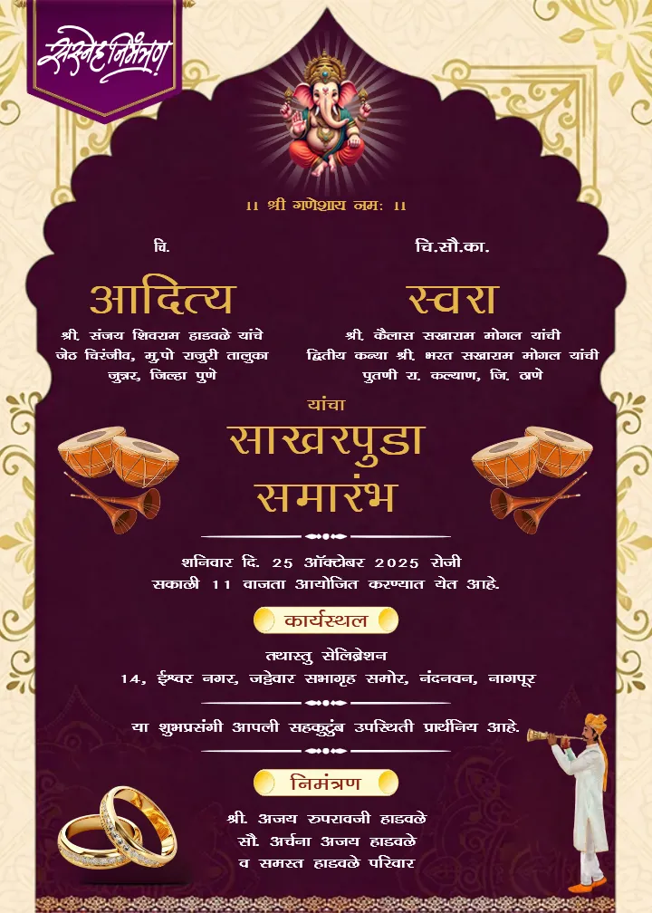
Sakharpuda Invitation Card Marathi with Ring Ceremony Art
Latest Sakharpuda Invitation Card Marathi Template
Latest Marathi Wedding Invitation Card Designs for Couples
Traditional Marathi Wedding Invitation Card Design for Event
Wedding Invitation Card in Marathi Traditional Designs
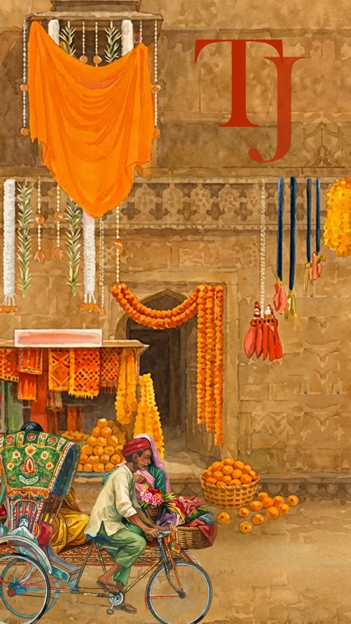
Download Modern Wedding Invitation Video Online Easily
Marathi Wedding Invitation Card with Ganesh Theme

Tamil Wedding Invitation Video with Traditional Theme
Best Free Online Invitation Card Maker for Every Occasion
What is an Invitation Card?
An invitation card is like a special message or a special thing that invites your friends and family to join you in celebrating happy moments. An invitation card could be for a Invitation card Wedding, a Birthday, an engagement, or it can be for any occasion in which we want to invite the guests to attend the ceremony, and have a fun traditional party. A nice invitation card helps everyone know about the big day and gets them excited!
A nice invitation card helps everyone know about the big day and gets them excited! An invitation card is the first thing that the guest sees before attending any ceremony. It is a trailer of a movie because when we see a trailer of an upcoming movie. We are getting excited and curious after watching the trailer. It tells about the film, like how fun it is.
As well, the invitation card is also like a trailer of the ceremony, it tells about the ceremony to the guest how the ceremony will gonna celebrated, like the date of the ceremony, time, venue, about the function, rituals, fun games, and other activities that gonna be done on the ceremony day.
An invitation card's main purpose is to warmly invite guests to the ceremony. It also includes heartfelt greetings to welcome the guest into the ceremony.
Why is the Invitation Card Important?
An invitation card serves multiple purposes, the most important of which is being the first representation of messages about the commencement of any new celebration by the family of the bride. It’s the first indicator of the kind of celebration the invitee is going to experience. The first, most important, and foremost indicator of the elation that the family of the bride wishes to share during any wedding event is the invitation card, which holds great importance and serves the purpose. It also serves great importance to the invitees by equipping them with important information like the date, time, venue, dress code, and any important additional information which the host family feels is important to share, for the invitees to ensure they prepare for the event and attend the function.
Sending a beautifully crafted invitation card with an invitation card design is also an emotional expression as it serves the purpose of warmly and respectfully welcoming the invitees to the event. It brings the invitees a step near to the event and makes them feel important. It is especially important to design the card with the invitees' interests in mind for cultural wedding events like the Mehndi ceremony, festivities surrounding the wedding, card design excitement and mood of the event, wishes, responsibilities, and importance, information equip, prior notice to everyone about their mood and excitement. All in all invitation card is important to emotional errands, interdependency on happiness.
To invite the guest, there are two types of invitation cards: the paper-based invitation card and the online invitation card.
Why Use Online Invitation Cards?
Nowadays, the new generation people like to use online invitation cards. They can be easily created on a computer or mobile phone, which makes them readily available to everyone. They can be edited easily, they don’t overrun on expenses, and they have a pleasing appearance. No need to have any designing skills. Additionally, caricatures of people, family photos, or even sweet sayings can be edited according to you. Moreover, invitation cards can be easily customized.
Sending invitations via online Crafty Art the online invitation card maker makes them instant and accessible; that’s why online invitation cards reign supreme. They can be sent via WhatsApp, Instagram, or Facebook. This is extremely beneficial, whether your guests are near or far; there is no need to wait for printing or delivery.
All of them can be done digitally. Without the need to print or ship cards, one can go entirely down the digital route. This also has other advantages, such as no charges owing to printing or delivery, as well as the cards being made free of cost. Several online invitation card makers are available that are flexible and can be tailored to the user’s requirements.
An online invitation card maker is a tool for making invitation cards. Here you can find so many ready-to-use templates, and you can also customize the invitation card as you want.
By the use of the invitation maker tool, you can create the Invitation Card in English easily for any ceremony at any time, and can be made from anywhere no matter you are at home or anywhere else, by just your phone or a computer.
Let me suggest the amazing, user-friendly tool Crafty Art.
Why Use an Online Invitation Card Maker?
A modern online invitation card maker free helps you make your own cards quickly and easily. You don’t need to go to a shop. These online tools show you what your card will look like right away!
You can change colors, pictures, and words to make the card your own. Many websites have a free online video invitation card maker without a watermark, so your card looks clean and pretty.
If you need a card invitation for a birthday or a fancy engagement invitation card, you can make it online. You don’t need to be a designer, just have fun and be creative!
And if you're in a hurry, an online invitation card maker free helps you finish your card super fast.
About Crafty Art, the Invitation Maker Tool:
There is an online invitation card maker tool whose name is Crafty Art. It is so user-friendly that it will provide many different ceremony invitation card templates for free to use.
Many ready-to-use English invitation card maker free can be used to create an invitation card with an invitation card maker tool, allowing users to edit the templates as needed. There are so many templates that are free to use, and to use some extra special or premium templates, you have to pay for them. But you know what the extra benefit is?
There is something for everyone that can fit into every budget.
Why Choose Crafty Art to Make a Digital Invitation Card?
Crafty art is one of the most user-friendly free online invitation maker tools that helps to make all types of invitation cards for free, like birthday invitation cards, Reception invitation cards, wedding invitation cards, engagement invitation cards, baby shower invitation cards, and so on. Crafty art allows you to create an invitation card in your home language. It supports all the languages and provides a readymade Invitation Card template. So there is no need for any designing skills, and a crafty art invitation helps to make your ceremony memorable.
We help you choose colors, pictures, words, and styles that match you. You can choose a simple card, a colorful card, or a card with fun designs. Every invite card becomes a memory you will always keep with you.
Crafty Art invitations are easy to make and full of happy feelings. You can give these Crafty Art invitation cards to your family and friends and make them feel part of your joy. These are perfect for sharing your love with everyone you care about.
At Crafty Art, you can find so many invitation designs for different types of ceremonies, and you can create the invitation card in English (इनविटेशन कार्ड इन इंग्लिश), Hindi, Gujarati, Marathi, in any language that you want. One of the best online Marathi invitation maker tools for free is Crafty Art. Here you can download and create the invitation card for free, and can easily download the invitation card without a watermark for free.
Now, with the help of Crafty Art's invitation card maker, you can make your own pretty invitation cards online on the computer or phone. It’s super easy! You can choose an invitation design you like, change the words and pictures, and download it quickly. You don’t need to be an artist. From simple to fancy looks, your card will show how fun your event will be!
Crafty art is a user-friendly tool for all languages. It can be like a Marathi invitation card maker free, Gujarati invitation card maker free, Kannada invitation card maker, Malayalam invitation card maker, Hindi invitation card maker free, also you can also download a free PDF of all invitation cards.
Features of crafty art
1. Ready-made invitation card Templates
Crafty art has a big collection of ready-made invitation card templates and designs invitation cards that help you to create your favourite crafty art invitation card.
2. Easy Customization
You don’t need design skills. Just edit text, change colours, add photos, or adjust fonts with a simple, user-friendly editor.
3. Wide Variety of Themes
From traditional Indian styles to modern minimal designs, floral themes, cultural motifs, cartoon styles, and elegant luxury looks—Crafty Art has options for every taste.
4. High-Quality Downloads
After creating your invitation card online for free, you can easily download your invitation card in HD quality and also in all formats for free without any watermark.
5. Add Photos & Music (for videos)
For invitation videos, you can add couple photos, short messages, and background music to create a personal and emotional touch.
6. No Watermark on Downloads
Crafty Art allows watermark-free downloads, giving your card or video a clean, professional finish.
7. Free & Premium Options
You get many free designs, plus premium templates for extra creativity and elegance.
Invitation Cards for Every Occasion
You can make many kinds of invitation cards using a fun and easy invitation card maker. Let’s look at some special ones:
- Wedding invitation card – These are pretty and fancy cards to tell everyone about the big wedding day.
- Birthday invitation card maker free – Bright and happy cards for your birthday party. You can pick and change them easily.
- Engagement invitation card – Lovely and sweet cards to invite people to your special day.
- Naming ceremony invitation card online editing free download – Make cute cards to tell everyone your baby’s name.
- Cradle ceremony invitation templates free download – Fun cards to invite people to see your new baby.
- Mundan invitation card maker online free – Special cards for your baby’s first haircut.
- Annaprashan invitation card online free – Pretty cards to invite people to your baby’s first food day.
- Upanayanam invitation card maker free – Traditional cards for important family prayers.
- Rice ceremony invitation card online free – Cards that tell about your baby’s happy day with rice.
- Bangle ceremony invitation template free download – Colorful cards with bangles for happy celebrations.
- Shradh vidhi invitation card - with respectful words and motifs, invitation cards for shradh vidhi.
- Housewarming / griha pravesh invitation card - cards that tell about your new home ceremony.
- Party invitation card - this card is used for the party invitation to invite guests to the party.
- Ear piercing invitation template free online PDF – Easy-to-use PDF cards for your baby’s ear-piercing day.
- English invitation card – Formal and elegant cards designed in English for all occasions.
With a good invitation card maker, you can choose any card, add your pictures and words, and make your own beautiful invitation cards right from home!
Types of Template Designs for the Invitation Cards that Crafty Art has
When we plan a wedding, birthday, engagement, or any other happy occasion, the first thing we need is a beautiful invitation card. At Crafty Art, you will find many ready-to-use, designed invitation card templates. These templates are easy to edit, simple to customize, and perfect for every event.
Invitation templates are like pre-made designs where you just have to add your name, date, venue, and details. You don’t have to design from the beginning. Crafty Art gives you so many choices that match your theme, tradition, and style.
- Traditional Invitation Template
With designs that feature intricate details from different art forms like mandalas, floral designs, paisley, and borders. These are perfect for weddings and cultural events. The color schemes are also very rich and elegant.
- Simple And Modern Template
Aimed for minimalism, these templates feature more of a clean, stylized, and diffused look. More suited for receptions and corporate events due to their neat designs and soft colors.
- Floral Invitations
These templates feature nature-themed arrangements. These nature-inspired templates are used for events like birthdays, baby showers, mehndi, and haldi
- Picture-Based Templates.
These are great for save the date cards, weddings, anniversaries, and birthdays as they let the user upload their picture and customize the invitation card.
- Cartoon and Illustration Templates.
These are fun and freat kids' birthdays, kids' naming ceremonies, and even a fun wedding invite. These have cute illustrations like couple and baby cartoons, doodles, and character icons.
- Festival-Based Templates.
These are designed for festive seasons like Diwali, Holi, Navratri, Eid, Christmas, etc. They have festive colors, lights, and other festive graphics.
- Luxurious and Premium Templates.
These are high-end with royal gold texture, matte and glossy effects, and elegant font. These are perfect for luxurious wedding invites and grand events.
Why Choose Crafty Art Invitation Templates?
- Easy to customize (add your name, date, and details).
- Beautiful designs for every occasion.
- Time-saving (no need to start from scratch).
- Styles available in modern, traditional, festive, and simple themes.
Basic Format of an Invitation Card
Host Line / Who is Inviting
The first section spells out who is extending the invitation.
Examples:
“Mr. and Mrs. Sharma request your presence.”
“With the blessings of the Almighty, the Gupta Family invites you.”
Occasion Line
The second part clearly states the event.
Examples:
“On the wedding of their beloved daughter”
“To celebrate the housewarming ceremony”
Name of the Person (s)
This is the most important part of the invitation and, naturally, the title of the event.
Examples:
"Bride & Groom names in a wedding card."
"The birthday boy/girl’s name in a birthday card."
This is very important. Guests must know when to come. Always write the date, day, and time clearly.
Example:
“On Sunday, 5th October 2025, at 7:00 PM onwards”
Venue / Address
Mention the exact location where the function will be held.
Example:
“Hotel Royal Palace, Near City Center, New Delhi”
You can also add a landmark or map link for convenience.
Optional Special Notes
Sometimes additional information is provided, for instance:
Dress code (if offered).
RSVP contact details.
Mention of rituals, dinner, or a dance party.
Example: Format for an invitation card
"Mrs. Nirmala & Mr. Anurag Anesha"
With Great pleasure, we co-ordinally invite you to the Mundan Ceremony of our son Alvinit
on Sunday,
28th January, 2025
From 12:10 pm onwards
Venue: Veerashaiva Kalyana Mantapa Ring Road, ONV Layout, Kallachi
How to Design an Invitation Card Online – Step-by-Step Guide
You can make your own invitation card all by yourself! Use free online tools to make pretty and fun cards for your birthday, wedding, naming ceremony, or house party. You don’t need to know design - just follow these easy steps!
Step 1: Pick an Invitation Card Template
Start with a ready-made design. Choose from lots of wedding invitation cards, engagement invitation card templates, or use a birthday invitation card maker free.
We also have special cards like:
- Bangle ceremony invitation template free download
- Upanayanam invitation card maker free
- Rice ceremony invitation card online free
Pick what you like best!
Step 2: Add Your Event Details
Write names, dates, and venues. You can even create an invitation card in English (इनविटेशन कार्ड इन इंग्लिश).
You can make:
- Annaprashan invitation card online free
- Naming ceremony invitation card online editing free download
- Mundan invitation card maker online free
Want it in Hindi? No problem! You can write in Hindi too, like this: इनविटेशन कार्ड. You can even add nice poems or prayers.
Step 3: Design Your Invite Card
Now the fun part! Use our free online invitation card design tools to make your invite card look pretty. You can:
- Pick your favorite colors and fonts
- Add pictures and icons
- Move things around your way
Make it look like a Crafty Art invitation or a modern invitation card design online. You can also design an invitation card in your own style with card design for invitation.
Step 4: Look at Your Card Before You Save
Before you finish, look at your invitation card designs. Make sure:
- Everything is straight
- Words are correct
- Pictures look nice
Your invite card design should be easy to read and pretty. Whether it’s a digital invitation card online or printed on paper, your invitation cards design will look great!
Step 5: Download or Share – It’s Free!
Now your card is ready! With our online invitation card maker free without watermark, you can:
- Download in good quality (PDF, JPG, PNG)
- Share your online invitation card on WhatsApp, Facebook, or Email
- Print your design card invitation too
And guess what? It’s all FREE and there’s no logo or brand mark!
Start Creating Online Invitation Cards for Free in Marathi and Hindi
Making a beautiful invitation card is now easy with an online invitation card maker free without a watermark. You can create wedding, birthday, or festival invites using simple tools available in both Marathi and Hindi. Many people prefer an invitation card maker Marathi or an invitation card maker Hindi because it lets them design in their own language with familiar fonts. Platforms that offer free online invitation card design make the whole process quick just choose a layout, add photos, and type your event details. If you want local-style invites, options like marathi invitation card online free or invitation card design online free without watermark help you download high-quality cards without extra charges.
You can explore a wide range of invitation card design templates for free download that include modern, floral, and traditional invitation card maker styles. Marathi users especially love invitation card maker marathi online free and marathi wedding invitation card maker online free with photo, as these offer cultural patterns and editable layouts. With tools like Crafty Art, you can also enjoy crafty art free download options to customize cards easily. Whether you want an online invitation card maker in Hindi or simply need to create an invitation card online, these platforms give you flexible, watermark-free formats and simple invitation card format options for every event.
Explore Top Template Categories :
Customer Reviews
4.7 out of 5
5 customer ratings
5 star
60%
4 star
40%
3 star
0%
2 star
0%
1 star
0%
Why did you leave this rating?
Amazing, above expectations!
Our Customer Feedback
Don’t take our word for it. Trust our customers
P
Priya Mehta
“I absolutely love using Crafty Art for all my invitation needs! Crafty Art has a wide variety of editable templates that are not only beautiful but also super easy to customize. The quality and creativity that Crafty Art offers are unmatched. It's my go-to design platform every time I need something special. Highly recommended for anyone looking to create stunning invitations with ease!”
R
Rahul Deshmukh
“If you're looking for unique and professional-looking designs, Crafty Art is the best place to go. I recently used Crafty Art to make an invitation story and was amazed by how smooth the entire process was. The site is user-friendly, affordable, and filled with options for every occasion. Thanks to Crafty Art, I could create something memorable without hiring a designer. I’ll definitely be back for more templates!”
H
Heta Jariwala
“Crafty Art is one of the best platform for graphic design. They have a lot of designers, so they gave modern & new designs for every ceremony. For customization on Crafty Art’s editor was really good, it is easy to use & has a user-friendly interface. Great Experience working with Crafty Art.”
R
Ramesh Pawar
“Crafty Art is the best solution for every ceremony invitation card. This platform is updated daily, they provide new designs daily for every ceremony & and all designs are easy to use. Crafty Art also offers a video invitation for any ceremony. To edit any designs, not need any type of design skills. Love the smooth editing platform, Crafty Art.”
A
Arjun Mehra
“Crafty Art is amazing! Whether you need something simple or something really unique, they have it all. The designs are creative, the quality is top-notch, and the service is super reliable. Highly recommended!”
Have more Questions?
See our help center or send us a message!
FAQ's About Invitation Card
Why should I choose Crafty Art for my invitation cards?
Can I customize my invitation cards?
How do I order custom invitations?
Is printing available for my invitation card?
Is the invitation card maker free to use?
What is an invitation card, and why is it important?
Features
Create Invitation
Create Video Invitation
Wedding
Baby Shower
Birthday
Puja
Funeral
Naming Ceremony
Gender Reveal
Inauguration
Engagement
Stationery Design
Caricature Maker New
AI Tools New
Company
Legal
